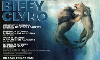

The illustration is representing their album as it features as the main aspect. The bold writing is simplistic and easy to read. Also the white against the dark blue/ black background makes the white text stand out more. Also I think the name Biffy Clryo in large text in a deep blue blends in well but stands out. I like how this is image based and the image is very strong of the lion and lioness. This may be to symbolize male and female rivalry. The colour scheme works well with the image as it makes it stand out more so you are immediately drawn in by the image.
Pendulum - Advert

I like how the colours are bright and bold and emphasizes pendulums unusual themes. Also the circle with bold colours in which looks like a maze draws you in immediately. The patterned background also goes well with the unusual themes they have. Further more the bold yellow writing stands out against the background. But I think there is too many colours to concentrate on to really take in this particular advert release. To improve I would make it more image based and less colours. Also there is a lot of text at the bottom of the advert I think they should cut it down as it seems like too much information.
No comments:
Post a Comment