This week we were given the time to plan and storyboard our video for the following week where we will be going to Long Benton CLC to film and create our own preliminary music video. For this we made sure that we worked as a group to all put in ideas that we had to make our video as best as we could. We had to decide on what we were going to do with the song as we needed a good storyline. We have decided that we are going to do a comical video as the song choice is very quirky and full of good props we could use to make the video as best. By storyboarding our work it meant that when it came to filming we could see exactly what we were going to film and where, we added the camera angles on so that we could also see what we needed to use for this.
Deciding on roles within the group was pretty easy as we had a good ration within our group. We chose Sam as being the main performer and he was happy with this as the singer is also a boy and can link in well, then we decided that the rest of us all being girls will be in it. This is so that we could all contribute to the developing of the video. We decided that when it came to editing the video we would all do some of the work. We would use a rotation so that we all equally got to edit the video.
Friday, 19 November 2010
Thursday, 18 November 2010
Summer Homework Album Covers Analysis
Lady GaGa Album - The Fame

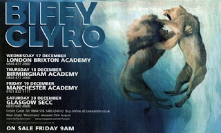
Biffy Clryo Album - Puzzle

Rihanna Album - Umbrella

By Charlotte Davis

This album was released in August, 2008 by Interscope Records. Lady GaGas brand image is very unusual. Usually the demographic aimed at teenagers would recognise her for her lightening bolt down the side of her face. Yet this album cover you can see half of the sunglasses have diamonds and the other half has ‘The Fame’ written on it. This may be to symbolize wealth and power which comes with fame. Also these sunglasses emphasise her unique fashion style as each music video she has been in she has worn something outrageous for example in her music video ‘Telephone’ she wore a blue headdress made out of telephones. I really like this album cover as its striking the unusual sunglasses draw you in straight away. Also the minimalist text at the bottom looks classy which again will appeal to her demographic.
Biffy Clryo Album - Puzzle
Biffy Clyro’s Album ‘Puzzle’ This is a very clever album cover as it is a man made out of a puzzle with something missing. The text at the top left is quite small but bold and stands out. The way the man is sitting in this particular image looks as If he is worried. This may be to do with a relationship that he can’t understand. Because the image is side on it is unusual as most album covers have face on covers and close ups.
Rihanna Album - Umbrella
Rihanna’s album cover Umbrella is very effective and obviously links to the song ‘Umbrella’ as there is an umbrella in the image and water. I really like this album cover as it makes her look feisty and interesting. Also the use of her costume white and black makes it as though she has two sides one good and one bad. Also the fact that she isn’t using her umbrella when there is water shows she has strength. Rihanna written in red makes her name stand out but I’m not sure on the colour they have chosen as it doesn’t go with the image. Her demographic would be teenagers as she is a young contemporary artist and her songs reflect relationships which is what a lot of teenagers can relate too.
By Charlotte Davis
Summer Analysis Album Adverts
Beyonce - Single Ladies Advert

Pendulum - Advert


The illustration is representing their album as it features as the main aspect. The bold writing is simplistic and easy to read. Also the white against the dark blue/ black background makes the white text stand out more. Also I think the name Biffy Clryo in large text in a deep blue blends in well but stands out. I like how this is image based and the image is very strong of the lion and lioness. This may be to symbolize male and female rivalry. The colour scheme works well with the image as it makes it stand out more so you are immediately drawn in by the image.
Pendulum - Advert

I like how the colours are bright and bold and emphasizes pendulums unusual themes. Also the circle with bold colours in which looks like a maze draws you in immediately. The patterned background also goes well with the unusual themes they have. Further more the bold yellow writing stands out against the background. But I think there is too many colours to concentrate on to really take in this particular advert release. To improve I would make it more image based and less colours. Also there is a lot of text at the bottom of the advert I think they should cut it down as it seems like too much information.
Summer Analysis Album Covers
Biffy Clyro - Only Revolutions


This is the album which includes the song ‘Many of Horror’. Biffy Clyro is originally from
Beyonce - Single Ladies

This CD cover for Beyonce is very effective as she is known as a diva and here there are many details that represent this for example: the text almost looks shiny and expensive, the bracelet she has on has diamonds on it again emphasizing diva. Yet her face is very soft with light make up and she looks very beautiful and Beyonce is known for her beauty which is another factor as to why they have chosen this close up of her face, on the front cover. Her hands behind her head pulling her hair back suggest to me that she is showing who she really is almost pulling back the curtains and letting everyone know who she is. It also shows me she isn’t afraid. In the right hand bottom corner the words ‘I am sasha fierce’ again gives off this idea of her wanting to know this is who she is and she has two sides to her and that she is more complex. Also the white and greys on the album cover links with the song Single Ladies as in that song all that Is used it white black and grey throughout the video. Also the emotion she is projecting through her eyes is very calm yet looks suspicious. Further more, the emotion on her face seems to show her being satisfied and again calm as she has shown everyone who she really is
Pendulum - Immersion

This is Pendulums new album from 2010. Throughout there different album covers there is an obvious link of fantasy for example there album called ‘Hold your colour’ which is the picture below again looks unusual and Pendulum have kept this theme throughout there album covers. I really like the front cover or immersion as it links well to there style of drum and bass being unusual. Also the text used is bold and stands out yet it isn’t that large and the colour isn’t too different from some of the colours in the background. This makes it look more professional. I think the idea of using an under sea effect was really clever and makes you focus on all the details and the light shining down in the two people really draws you in. Also the little creatures like the jellyfish with the little lights shining on them again makes you focus in on the cover.
Summer Analysis Of Music Videos
Biffy Clyro - Many Of Horror
Biffy Clyro is an artist who is aimed at teenagers and adults around the ages of 15 to 30. The genre of his music is rock. I really like this music video as the performance in it is excellent for example as you can see in the pictures below each time they play there instrument a lightening affects almost jumps out of the guitar. Also I like how they have made it simple at the beginning of the music video making Biffy in black and white yet the blue in the background makes you expect something to happen. The effects in this video make it interesting and without them it would be plain. The skull effect with a pink washout on the picture below is really effective also his head shakes into it almost in the video. This really emphasizes that it is a rock band and it’s gritty and
 harsh. The lighting is used very well in the performance again to make it
  stand out as it gives you more too look at and also the contrast of the darkness in the room with the sudden beam of lightening and white light behind them makes the video more exciting. The constant jump cuts from his face to the performance again adds a thrill to the video as well as the different long shots and midshots through out the performance. Furthermore the camera movement including the panning around the band when performing makes it look more realistic and makes you feel as if you were there as it enables you to see around the whole room.
Pendulum - Watercolour

Biffy Clyro is an artist who is aimed at teenagers and adults around the ages of 15 to 30. The genre of his music is rock. I really like this music video as the performance in it is excellent for example as you can see in the pictures below each time they play
 there instrument a lightening affects almost jumps out of the guitar. Also I like how they have made it simple at the beginning of the music video making Biffy in black and white yet the blue in the background makes you expect something to happen. The effects in this video make it interesting and without them it would be plain. The skull effect with a pink washout on the picture below is really effective also his head shakes into it almost in the video. This really emphasizes that it is a rock band and it’s gritty and
 harsh. The lighting is used very well in the performance again to make it
  stand out as it gives you more too look at and also the contrast of the darkness in the room with the sudden beam of lightening and white light behind them makes the video more exciting. The constant jump cuts from his face to the performance again adds a thrill to the video as well as the different long shots and midshots through out the performance. Furthermore the camera movement including the panning around the band when performing makes it look more realistic and makes you feel as if you were there as it enables you to see around the whole room.
Pendulum - Watercolour
Pendulum are a band aimed at teenagers and adults ages between 15-30. There genre is drum and bass. This is one of my favourite music videos as it is very well set out from the beginning with the sky and planet turning into an eye then looks as though the sky was the eye with all the colours and reflections of the extreme close up of the iris.

Also the use of the water as the band are playing emphasizes the power and volume as it almost explodes off the drums and off there faces as you can see below in the picture of the drum player. Also the fading in and out of the main singer at the beginning from him singing back into the sky was a really clever idea as it made you concentrate on the character and then the sky. The mise en Scene really stood out with all the different backgrounds including the main singer behind loads of  speakers then the sky and the crowd all in black jumpingrain or sweat in time with the beat. Also the fast edits from each different background in time with the beat I thought worked really well as it was very fast
and got faster so the suspense
grew throughout the song. Which made the video become more exciting as the music went on instead of dragging on and becoming dull. Lots of close ups and high angles were used in this video which again added to the excitement as it gave variety which engages the audience.
Beyonce - Singe Ladies
 Beyonce has a target group of all ages as her voice is very flexible. Her genre of music is R&B and pop music with the occasional rap. Single ladies is another favourite music video of mine as it seems very simple to watch just three dancers. Yet after I have analyzed it, it has become much more complicated. As you can see the mise en scene is quite plane all in black leotards with black high heels. Yet Beyonce stands out with the gold metal glove on her hand. I think this music video is particularly clever as it has
 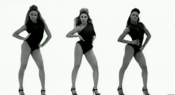 managed to keep the audiences attention by constantly panning around the dancers and zooming in and out. Also the lighting has definitely helped in this music video. From grey to bright white then a flash to black. Also usually there in a longshot through most of the music video so you can focus on the dancing but occasionally to vary the video there are midshots and close ups of Beyonce’s face. Furthermore to add to the lighting, the shadows that have been made behind and in front of them make it more interesting as it looks as though there are more dancers in
  the room creating more movement for the audience to watch.

Summer Homework
Analysis of Sam Sparro-Black and Gold
This video is very concept based and relies mainly on the video going to the beat, they use the lighting from hey night sky to emphasize this, every beat the same piece of footage come onto the screen, this is a very good effect to work to and I like the idea a lot. Also on the beat they smash up various gold objects, this is one of my favourite shots as it is slowed down to show all the pieces shattering.
This video is very concept based and relies mainly on the video going to the beat, they use the lighting from hey night sky to emphasize this, every beat the same piece of footage come onto the screen, this is a very good effect to work to and I like the idea a lot. Also on the beat they smash up various gold objects, this is one of my favourite shots as it is slowed down to show all the pieces shattering.

There is not a lot of performance throughout the video and mainly there is only one shot of him singing and this is a close up on his face. I like this as it makes the song more intense for the audience.


I really like the shot where they have filmed the traffic passing by and sped it up. This is a really good effect and if it links into my music video when I come to create it I will add it in. also it has been sped up to give a better effect.

Another good shot was when they filmed Sam Sparro from one side of his face and then just a plain background. I felt like this gave an edge of suspicion to the video.
With this being a concept video I would expect the target audience to be about the same as Florence and the machines although I think that the older end of the demographic will get the idea of the song more that the younger. I really like the idea of the concept but I don’t think I will be adding this into my song as I would prefer a narrative based video as I can do a lot more with it.
Sam Sparro Album Cover
The album cover links into the song very well. It has an element of the song black and gold in it by using the stretched colour as in the song where the traffic is passing by. The CD is very simplistic with just having the name of the artist and an image. The image relates to the song Black and Gold in many ways. It takes elements of the lyrics and adds them onto the cover ‘Stars fell out of the sky’ the night sky on the background of the image, this makes the connection between the songs on the CD and the actual CD.

Sam Sparro CD release advert
The advert also does the same as Florence and the Machines, it is very simplistic but gives all of the details that will be needed, also it uses the same image to promote the CD as is on the cover of the CD. This advert is only for the album release party but it still has the same qualities as the advert would have. I really like the idea of having two separate release adverts, one for the release party and another for the actual release of the CD.
The advert also does the same as Florence and the Machines, it is very simplistic but gives all of the details that will be needed, also it uses the same image to promote the CD as is on the cover of the CD. This advert is only for the album release party but it still has the same qualities as the advert would have. I really like the idea of having two separate release adverts, one for the release party and another for the actual release of the CD.

Summer Homework
Analysis of Florence and the Machine- Drumming song
Florence’s video has a unique style and when she is performing in her music video for drumming song it is different and really shows the style of her performance really well. This specific music video is more of a visual song than narrative but has some narrative through it. It has a lot of fast moving shots to catch the audience’s attention and keeps you enticed into the song. Most of the video the song is performed by Florence herself and appears to be in every shot that is on screen as she is the main performer, but also she has some other girls on the screen that follow what she does like she is there role model. It is also narrative based in the idea that she has two personalities and she is showing them both within this song and singing about letting them out, the nun outfit and the black short body suit really show of the contrast in the personalities very well, the black of the body suit may also relate to the lyrics within the song where it talks about sinning and that she is showering her evil side to the world. Throughout the song there is only ever two costumes that she is wearing, and it all depends on the speed of the song, at the start of the song it is slow and calm and this is where she is wearing the nun costume, then when the speed of the song speeds up it adds more of the black dress in and when it slows back down goes back to the nun. This also shows the contrast in personalities, like the dark side of her prefers the fast moving extravagant parts and the nun is calm and collected.
On the drumming beats there is always movement within her, she either moves her hair or her body to the beat to relate to the title, Drumming song. This shows her originality within the video as not many other artists would have the uniqueness to pull it off like Florence does.
There is one more shot that really catches my attention and it is half way through the song, this is a close up of her as she starts to throw her hair, I think this shows her letting go of her hidden personality and letting everyone see what it is. This is a quick insert and goes on the beat but I really think it emphasises the darkness breaking out from within her.


Florence and the machine CD release advert analysis
For the advert for the CD release she keeps it simple by adding the same image that is on the CD cover, this can be helpful as when the demographic come to buy the CD they will know what they are looking for. Also she only adds the date of release and what comes included within the CD, I like this idea as it’s not overcrowded and messy, also by sticking to the same image as the CD she can use the same design as she did for the CD cover which is a good idea to link her work together instead of having completely different designs for each. I like this idea that she has created and when I come to create my digipak I may think about using the same line of creativity that Florence has done.
Florence’s video has a unique style and when she is performing in her music video for drumming song it is different and really shows the style of her performance really well. This specific music video is more of a visual song than narrative but has some narrative through it. It has a lot of fast moving shots to catch the audience’s attention and keeps you enticed into the song. Most of the video the song is performed by Florence herself and appears to be in every shot that is on screen as she is the main performer, but also she has some other girls on the screen that follow what she does like she is there role model. It is also narrative based in the idea that she has two personalities and she is showing them both within this song and singing about letting them out, the nun outfit and the black short body suit really show of the contrast in the personalities very well, the black of the body suit may also relate to the lyrics within the song where it talks about sinning and that she is showering her evil side to the world. Throughout the song there is only ever two costumes that she is wearing, and it all depends on the speed of the song, at the start of the song it is slow and calm and this is where she is wearing the nun costume, then when the speed of the song speeds up it adds more of the black dress in and when it slows back down goes back to the nun. This also shows the contrast in personalities, like the dark side of her prefers the fast moving extravagant parts and the nun is calm and collected.
On the drumming beats there is always movement within her, she either moves her hair or her body to the beat to relate to the title, Drumming song. This shows her originality within the video as not many other artists would have the uniqueness to pull it off like Florence does.
There is a great shot where she is lying on the ground and moving her body to the beat, this is to show that the drumming is in control of her and she cant stop it. I really like it as the lighting lies across the floor up to where she is, also by lying on the ground with her arms apart makes her look vulnerable, which gets completely contrasted later in the song.

Also I like the shot where they are holding her up as if to worship her, with this being a very Christian based song this shows that they think very highly of her and that with her dark personality she can now break free and be who she wants to be and the follow her in the same way. This is from a high angle and shows her expression on her face as being very powerful and dismissive to the people holding her up.


There is one more shot that really catches my attention and it is half way through the song, this is a close up of her as she starts to throw her hair, I think this shows her letting go of her hidden personality and letting everyone see what it is. This is a quick insert and goes on the beat but I really think it emphasises the darkness breaking out from within her.

I think the success of this video is very good. This was because I picked up on the story line at the start of the video, this is what I would like my video to do as it is the main part of a music video, also when I look at the performance in the video it is very striking and out there, it is inspiring for my future music video as I like the uniqueness of the performance.
I think that the target audience would be a large demographic from older teenagers through to 30s and 40s. I think this would be a very popular album and genre.
Florence and the machine CD cover analysis
The CD cover for Florence slates album ‘Lungs’ is very unique, it has a lot to do with the title and links every part of her cover to it. The front cover is very unique as the background is very striking, where as many other CD covers like to have the focus on the centre image, this although it is very eye catching can dfist5ract away from the purpose of the front cover. The main image of Florence with the lung on her body link to the title, this also show that Florence is not the typical codes and conventions follower she likes to be unique and go her own way in her music.
The back of the CD is a major contrast to the front, it has one main image clearly seen on a black background, and this also links to the title of the song with the image being of lungs. The back is very simplistic and I feel that is more eye catching than that of the front, also the front although it has a very bold background is very simplistic too. It only has the images and the name of the album and the artist, this makes it more successful as it is doesn’t try to over crowd the page.


Florence and the machine CD release advert analysis
For the advert for the CD release she keeps it simple by adding the same image that is on the CD cover, this can be helpful as when the demographic come to buy the CD they will know what they are looking for. Also she only adds the date of release and what comes included within the CD, I like this idea as it’s not overcrowded and messy, also by sticking to the same image as the CD she can use the same design as she did for the CD cover which is a good idea to link her work together instead of having completely different designs for each. I like this idea that she has created and when I come to create my digipak I may think about using the same line of creativity that Florence has done.
Summer Homework
 Mumford and Sons – The Cave
I really like the location and costumes in this video; it’s all in keeping with the band as the song as it’s not in your face and is very calm and casual. This links in with the white suites that the band is wearing. It has connotations of being calm and innocent which kind of contrasts with the motor bikes that they are riding on as they are stereotypically associated with dangerous bikers. The story line in this video is not very clear as it is more performance based which looks good. I think this is a very successful video, as it displays the band and really focuses on the song and not a narrative. My favourite shot but is the one in the picture above, where they exchange their insruments. The scenery behind them is beautiful and it looks good how the characters in the shot are almost blackened out due to the lighting. I also like the length of this shot and it stays until they walk away and the other men are just left there, it is a really good way to the end the music video as it’s a bit ambigious as to where Mumford and Sons have gone.

Blink 182 – Always
The main thing that stands out about this video is the editing. It makes the video looks messy but keeps it so you can see and understand what’s going on. I also like how this video balances and mixes performance and story line together well. Without the effect of the three-way split screening this video would not be as good or effective. Also without the split screening the story line would not be as clear. I think this video works really well as it’s different but still looks good. It also in keeps with the playfulness and perhaps messiness of the band. I like how the concept is continued throughout the video until the end, and I also like how the video starts and ends with pretty much the same shot of the flowers in the vase. I like this as it could mean that maybe the characters in the video have ended up in the same place or position as they had before.

Foals – Balloons
This is one of my favourite bands and music videos as it’s a bit weird and different. I like how the band is playing in something that looks like a front room. The decorations and wallpaper look very odd and vintage which ties in with the music and image of the band. This video does not really have a clear narrative but introduces ideas and concepts in to the video. For example the video begins with women in black dresses with black bob and then cuts to a bed of moving flowers. Instantly you think that this video is not normal because the flowers do not tie in with the song at all as it’s called balloons. However this could be some underlying message that the band are trying to get across. I also think this when you see the lead singer holding a bird, you wonder whether this is just to hold a bird or it has a meaning behind it, the concepts in this video of very peculiar and ambiguous. I like the shaky editing that is used when they are sitting on the table having tea; this continues throughout the video and looks really good as it looks perfectly un-polished and perfect. I think this video might not be as successful as others as it’s not to everyone’s tastes and does not have a very clear theme to it. I think this would appeal to their target audience as they would understand that this video links in with the music and personality of the band. My favourite shot in this is the ending shows a zoom out of the discarded room with the flickering light which leaves you left wondering what happened.

I like how simple yet effective this advert it, it only has three colours but because there is so much white, the texts really stand out from each other. For example the main image and the background in the picture are all white and then there are the three red stripes across them. This links with the name of the album that is being released as it’s called the blueprint three, and there are three red stripes. I think that this album release really links with the artist as Jay Z is so popular that his work and image can be recognised easily, so he does not need perhaps an image of himself on the advert. I think it’s a good idea to have the name of the songs that are currently out so people can see that they are on the album; they make this stand out by putting the song titles in bold so you can easily spot them. The fonts on this are very simple and plain but this in keeps with the calm tone of the advert. Except for the name of the artist, this is in a bigger bolder and different front the rest of it so it stands out and is clear to read.

This is an advert for the new album release of the Gorillaz. Like the Jay Z one it is very simple but effective. The fonts at the bottom of the page are simple and easily legible. I like how the top line of the text is plain and the bottom text is in bold. This makes the texts the same size even though one sentence is longer than the other one. The underneath that is the main website, I think this is very good because it gives the audience a chance to see details etc about the band. I like that the name of the band and album title is in wavy text as it ties in with the sea and looks like it’s part of it. I think it looks really good how there is a lot of sea which is darkened so that the white text is clearer. The image in the advert is very appropriate to the band and their image. As in all their videos they are not shown as being human, they are characters. So the image in the advert ties in with the band. The location of the image as well could also tie in with the name of the band as it’s outside and looks quite free which relates to the name of the album ‘plastic beach’ and possibly the name of the band ‘Gorillaz’ as they live outside.

This advert is different to the other two above; this one is very bright and colourful. The text and everything in it stands out from the black background which looks like space. The main image in the advert is a monkey, this could be linked to the name of the title of the album as it is called ‘Rooty’ and the monkey has a plant in this mouth from a tree, which could link as the word root is associated with trees. The pink down the left side of the advert makes it look edgey and ties in with the strangeness of this advert. This adverts links with the band and what they’re about as they’re ‘out there’ and loud. The title at the top with the band name is large compared to the rest of the text, this makes it stand out and one of the first things you see. The colouring of this title is good as well because if it was just plain white I don’t think that the text would stand out as much. The splattered colours on it link in with the pain down the side as it looks a bit like someone has splattered/split paint on the poster. The image of the monkey has been edited so it looks very soft which makes it appear gentle and calm. This contrasts with the chaos going on around him which makes it look not so distracting.
Friday, 12 November 2010
Diary Entry 2
This week we went to Long Benton CLC to film our preliminary video task. We completed this using a range of different techniques; we filmed inside outside and in the green screen studio. This is so that we could use this for parts within the song if we didn’t have enough footage. We recorded it twice on the green screen one with only Sam in it and then with all of us in it. This is to show diversity within our performances. The next thing we have to do is to complete the editing of the footage to a high standard; we have a week to complete this and then begin to complete an advert, DVD and DVD cover.
We decided instead of just editing one week that with the rotation to get everything completed that we would do the advert and DVD cover when we aren’t editing, this meant we could get more done than if we just waited until we had completed the editing. This meant that we would be a head of schedule.
We decided instead of just editing one week that with the rotation to get everything completed that we would do the advert and DVD cover when we aren’t editing, this meant we could get more done than if we just waited until we had completed the editing. This meant that we would be a head of schedule.
Thursday, 11 November 2010
Diary Entry 3
Within this week we developed our music video and our DVD cover advert and insert, we then showed them to the class and got our feedback for the completed project. This is where we took it in turns to edit this so that we could each have a turn and time to complete our music extras to the video.
Wednesday, 10 November 2010
Diary Entry 4
Over the next few weeks we had the summer holidays and over the summer holidays we were set a homework task. This meant that we had to research 3 music videos, 3 DVD covers and three adverts of music video releases. This gave us time to understand all of the concepts of the music industry so that when we came to complete our own research of music videos we had already completed some of the aspects of research. We then uploaded these onto the blog to show our research.
Monday, 8 November 2010
Mood board

We completed the mood board also as part of our initial ideas; this is so that we can show costumes, props and some of our location. We also linked the mood board to the artist and some of the lyrics within the song to represent what we are going to do at certain times of the song.
Initial Ideas Diagram
When we had picked our song we had a discussion before we started the sketching and mood boards, we did this so that we could all give our ideas and tell each other what we were thinking. We all managed after a quick discussion to agree on the main idea for our storyboards which was the idea of transformation from girl to a wolf, and this also links into the song lyrics ‘Howl’.

This is a diagram of our first initial sketches after we had chosen our song. We have chosen to complete a initial ideas sketch so that we had all of our ideas down on paper, this would help us a lot when its comes to deciding our actual ideas for the video and also it would be helpful when we are storyboarding because we have all of our ideas are in one place to just look at when completing the storyboard.

This is a diagram of our first initial sketches after we had chosen our song. We have chosen to complete a initial ideas sketch so that we had all of our ideas down on paper, this would help us a lot when its comes to deciding our actual ideas for the video and also it would be helpful when we are storyboarding because we have all of our ideas are in one place to just look at when completing the storyboard.
Sunday, 7 November 2010
Diary Entry 5
To start planning our music video we first needed to complete an initial ideas sketch. This helped us to put all of our ideas down onto paper and we had a discussion about what everyone would like to include within the video. Instead of completing the diagram straight away, we used one of our lessons to discuss our song choice and make sure we are all happy with it, and also to talk about the first ideas that we each had. The next couple of lessons we started on making our diagram, this would show everyone what the plan was for the video, and what we were basing it around. This was a good idea as we would use it later in the project to guide us through it.We also created a moodboard of images that would relate to our music video, this would help us later to design the mise en scene, genre and overall performance of the video. This would be very useful to us when we started our audience research.
Our Pitch - Powerpoint
This is our pitch, we completed this so that we could show our teachers our ideas that we had for the song, we did this so that if another group had chosen the same song we would have to produce this to try and get the song for our group. To do this we linked in research about the artist and the song and also about transformations, this was so that they could see the major ideas for the song and how we will link everything together.
Saturday, 6 November 2010
Hype Williams Music Video Director
Hype Williams
We researched a video directed called Hype Williams. We did this so we were able to understand different genres and styles of music videos. I found Hype Williams particularly interesting as he has worked with various famous artists that are listed below. Also I really liked the fisheye lense he used in Missy Elliot’s music video.
Harold "Hype" Williams was born in1970 in New York. He is known simply as Hype (with capital letters). He is an American music video and film director. Williams first work was tagging local billboards and playgrounds with his graffiti tag he named HYPE. He said: “That's probably what stimulated my interests in colour."
William’s signature style throughout the majority of his filming was the fisheye lense which distorted the camera view around the central focus. This was used in the following music videos: "Gimme Some More" by Busta Rhymes and "The Rain Supa Dupa Fly" by Missy Elliott. Another style includes: Since 2003, Williams has adopted a signature style combining a centre camera focus on the artist or actor's body from the torso upward and a solid colour background with a soft different-colour light being shown in the centre of the background, so as to give a sense of illumination of the background by the foreground subject. This has been displayed in "Gold Digger" by Kanye West, "Digital Girl" (Remix) by Jamie Foxx and Beyonce's "Video Phone".
Hype Williams by looking at the artists he has worked with his genre is usually Hiphop/R&B. these include: Missy Elliot, Ka nye West, Beyonce and Busta Rhymes.
We researched a video directed called Hype Williams. We did this so we were able to understand different genres and styles of music videos. I found Hype Williams particularly interesting as he has worked with various famous artists that are listed below. Also I really liked the fisheye lense he used in Missy Elliot’s music video.
Harold "Hype" Williams was born in1970 in New York. He is known simply as Hype (with capital letters). He is an American music video and film director. Williams first work was tagging local billboards and playgrounds with his graffiti tag he named HYPE. He said: “That's probably what stimulated my interests in colour."
William’s signature style throughout the majority of his filming was the fisheye lense which distorted the camera view around the central focus. This was used in the following music videos: "Gimme Some More" by Busta Rhymes and "The Rain Supa Dupa Fly" by Missy Elliott. Another style includes: Since 2003, Williams has adopted a signature style combining a centre camera focus on the artist or actor's body from the torso upward and a solid colour background with a soft different-colour light being shown in the centre of the background, so as to give a sense of illumination of the background by the foreground subject. This has been displayed in "Gold Digger" by Kanye West, "Digital Girl" (Remix) by Jamie Foxx and Beyonce's "Video Phone".
Hype Williams by looking at the artists he has worked with his genre is usually Hiphop/R&B. these include: Missy Elliot, Ka
 nye West, Beyonce and Busta Rhymes.


Audience Research
We got someone from our target audience and gave them a copy of the lyrics from the song we have chosen. We asked him to write down his own ideas of what he thought the story line might entail. Here is a copy of the annitated lyrics.

Name: Gus Sutton
Age: 17
Favourite genre of music: Indie Rock

He is part of our target audience as Florence and the Machine's genre is Indie Rock. We have listened to member of our target audience and decided to film in a wood and stick to the story line suggested.
Name: Sam Patterson
Age: 18
Favourite genre of music: Alternative
We interviewed Sam about our music video to ask which location and transformation would look best. We made him listen to the song once and them gave him a copy of the lyrics to read. We then gave him four locations and four transformations and asked him which one would work best and relate to the song most. This helped us understand what our target audience wanted.
Audience Research - Video
Name: Jonny Shepherd.
Age: 17
Favourite genre of music: Indie
Within this audience research we gave Jonny our completed story board and let him listen to the song. We then interviewed him about the links within the storyboard to the song and asked him if it suited our song best. This helped us see where we were going wrong and if what we had completed was relevant to our target audience.
Subscribe to:
Posts (Atom)