This week we were given the time to plan and storyboard our video for the following week where we will be going to Long Benton CLC to film and create our own preliminary music video. For this we made sure that we worked as a group to all put in ideas that we had to make our video as best as we could. We had to decide on what we were going to do with the song as we needed a good storyline. We have decided that we are going to do a comical video as the song choice is very quirky and full of good props we could use to make the video as best. By storyboarding our work it meant that when it came to filming we could see exactly what we were going to film and where, we added the camera angles on so that we could also see what we needed to use for this.
Deciding on roles within the group was pretty easy as we had a good ration within our group. We chose Sam as being the main performer and he was happy with this as the singer is also a boy and can link in well, then we decided that the rest of us all being girls will be in it. This is so that we could all contribute to the developing of the video. We decided that when it came to editing the video we would all do some of the work. We would use a rotation so that we all equally got to edit the video.
Friday, 19 November 2010
Thursday, 18 November 2010
Summer Homework Album Covers Analysis
Lady GaGa Album - The Fame

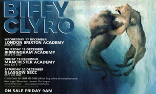
Biffy Clryo Album - Puzzle

Rihanna Album - Umbrella

By Charlotte Davis

This album was released in August, 2008 by Interscope Records. Lady GaGas brand image is very unusual. Usually the demographic aimed at teenagers would recognise her for her lightening bolt down the side of her face. Yet this album cover you can see half of the sunglasses have diamonds and the other half has ‘The Fame’ written on it. This may be to symbolize wealth and power which comes with fame. Also these sunglasses emphasise her unique fashion style as each music video she has been in she has worn something outrageous for example in her music video ‘Telephone’ she wore a blue headdress made out of telephones. I really like this album cover as its striking the unusual sunglasses draw you in straight away. Also the minimalist text at the bottom looks classy which again will appeal to her demographic.
Biffy Clryo Album - Puzzle
Biffy Clyro’s Album ‘Puzzle’ This is a very clever album cover as it is a man made out of a puzzle with something missing. The text at the top left is quite small but bold and stands out. The way the man is sitting in this particular image looks as If he is worried. This may be to do with a relationship that he can’t understand. Because the image is side on it is unusual as most album covers have face on covers and close ups.
Rihanna Album - Umbrella
Rihanna’s album cover Umbrella is very effective and obviously links to the song ‘Umbrella’ as there is an umbrella in the image and water. I really like this album cover as it makes her look feisty and interesting. Also the use of her costume white and black makes it as though she has two sides one good and one bad. Also the fact that she isn’t using her umbrella when there is water shows she has strength. Rihanna written in red makes her name stand out but I’m not sure on the colour they have chosen as it doesn’t go with the image. Her demographic would be teenagers as she is a young contemporary artist and her songs reflect relationships which is what a lot of teenagers can relate too.
By Charlotte Davis
Summer Analysis Album Adverts
Beyonce - Single Ladies Advert

Pendulum - Advert


The illustration is representing their album as it features as the main aspect. The bold writing is simplistic and easy to read. Also the white against the dark blue/ black background makes the white text stand out more. Also I think the name Biffy Clryo in large text in a deep blue blends in well but stands out. I like how this is image based and the image is very strong of the lion and lioness. This may be to symbolize male and female rivalry. The colour scheme works well with the image as it makes it stand out more so you are immediately drawn in by the image.
Pendulum - Advert

I like how the colours are bright and bold and emphasizes pendulums unusual themes. Also the circle with bold colours in which looks like a maze draws you in immediately. The patterned background also goes well with the unusual themes they have. Further more the bold yellow writing stands out against the background. But I think there is too many colours to concentrate on to really take in this particular advert release. To improve I would make it more image based and less colours. Also there is a lot of text at the bottom of the advert I think they should cut it down as it seems like too much information.
Summer Analysis Album Covers
Biffy Clyro - Only Revolutions


This is the album which includes the song ‘Many of Horror’. Biffy Clyro is originally from
Beyonce - Single Ladies

This CD cover for Beyonce is very effective as she is known as a diva and here there are many details that represent this for example: the text almost looks shiny and expensive, the bracelet she has on has diamonds on it again emphasizing diva. Yet her face is very soft with light make up and she looks very beautiful and Beyonce is known for her beauty which is another factor as to why they have chosen this close up of her face, on the front cover. Her hands behind her head pulling her hair back suggest to me that she is showing who she really is almost pulling back the curtains and letting everyone know who she is. It also shows me she isn’t afraid. In the right hand bottom corner the words ‘I am sasha fierce’ again gives off this idea of her wanting to know this is who she is and she has two sides to her and that she is more complex. Also the white and greys on the album cover links with the song Single Ladies as in that song all that Is used it white black and grey throughout the video. Also the emotion she is projecting through her eyes is very calm yet looks suspicious. Further more, the emotion on her face seems to show her being satisfied and again calm as she has shown everyone who she really is
Pendulum - Immersion

This is Pendulums new album from 2010. Throughout there different album covers there is an obvious link of fantasy for example there album called ‘Hold your colour’ which is the picture below again looks unusual and Pendulum have kept this theme throughout there album covers. I really like the front cover or immersion as it links well to there style of drum and bass being unusual. Also the text used is bold and stands out yet it isn’t that large and the colour isn’t too different from some of the colours in the background. This makes it look more professional. I think the idea of using an under sea effect was really clever and makes you focus on all the details and the light shining down in the two people really draws you in. Also the little creatures like the jellyfish with the little lights shining on them again makes you focus in on the cover.
Summer Analysis Of Music Videos
Biffy Clyro - Many Of Horror
Biffy Clyro is an artist who is aimed at teenagers and adults around the ages of 15 to 30. The genre of his music is rock. I really like this music video as the performance in it is excellent for example as you can see in the pictures below each time they play there instrument a lightening affects almost jumps out of the guitar. Also I like how they have made it simple at the beginning of the music video making Biffy in black and white yet the blue in the background makes you expect something to happen. The effects in this video make it interesting and without them it would be plain. The skull effect with a pink washout on the picture below is really effective also his head shakes into it almost in the video. This really emphasizes that it is a rock band and it’s gritty and
 harsh. The lighting is used very well in the performance again to make it
  stand out as it gives you more too look at and also the contrast of the darkness in the room with the sudden beam of lightening and white light behind them makes the video more exciting. The constant jump cuts from his face to the performance again adds a thrill to the video as well as the different long shots and midshots through out the performance. Furthermore the camera movement including the panning around the band when performing makes it look more realistic and makes you feel as if you were there as it enables you to see around the whole room.
Pendulum - Watercolour

Biffy Clyro is an artist who is aimed at teenagers and adults around the ages of 15 to 30. The genre of his music is rock. I really like this music video as the performance in it is excellent for example as you can see in the pictures below each time they play
 there instrument a lightening affects almost jumps out of the guitar. Also I like how they have made it simple at the beginning of the music video making Biffy in black and white yet the blue in the background makes you expect something to happen. The effects in this video make it interesting and without them it would be plain. The skull effect with a pink washout on the picture below is really effective also his head shakes into it almost in the video. This really emphasizes that it is a rock band and it’s gritty and
 harsh. The lighting is used very well in the performance again to make it
  stand out as it gives you more too look at and also the contrast of the darkness in the room with the sudden beam of lightening and white light behind them makes the video more exciting. The constant jump cuts from his face to the performance again adds a thrill to the video as well as the different long shots and midshots through out the performance. Furthermore the camera movement including the panning around the band when performing makes it look more realistic and makes you feel as if you were there as it enables you to see around the whole room.
Pendulum - Watercolour
Pendulum are a band aimed at teenagers and adults ages between 15-30. There genre is drum and bass. This is one of my favourite music videos as it is very well set out from the beginning with the sky and planet turning into an eye then looks as though the sky was the eye with all the colours and reflections of the extreme close up of the iris.

Also the use of the water as the band are playing emphasizes the power and volume as it almost explodes off the drums and off there faces as you can see below in the picture of the drum player. Also the fading in and out of the main singer at the beginning from him singing back into the sky was a really clever idea as it made you concentrate on the character and then the sky. The mise en Scene really stood out with all the different backgrounds including the main singer behind loads of  speakers then the sky and the crowd all in black jumpingrain or sweat in time with the beat. Also the fast edits from each different background in time with the beat I thought worked really well as it was very fast
and got faster so the suspense
grew throughout the song. Which made the video become more exciting as the music went on instead of dragging on and becoming dull. Lots of close ups and high angles were used in this video which again added to the excitement as it gave variety which engages the audience.
Beyonce - Singe Ladies
 Beyonce has a target group of all ages as her voice is very flexible. Her genre of music is R&B and pop music with the occasional rap. Single ladies is another favourite music video of mine as it seems very simple to watch just three dancers. Yet after I have analyzed it, it has become much more complicated. As you can see the mise en scene is quite plane all in black leotards with black high heels. Yet Beyonce stands out with the gold metal glove on her hand. I think this music video is particularly clever as it has
 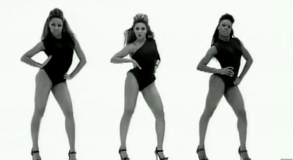 managed to keep the audiences attention by constantly panning around the dancers and zooming in and out. Also the lighting has definitely helped in this music video. From grey to bright white then a flash to black. Also usually there in a longshot through most of the music video so you can focus on the dancing but occasionally to vary the video there are midshots and close ups of Beyonce’s face. Furthermore to add to the lighting, the shadows that have been made behind and in front of them make it more interesting as it looks as though there are more dancers in
  the room creating more movement for the audience to watch.

Summer Homework
Analysis of Sam Sparro-Black and Gold
This video is very concept based and relies mainly on the video going to the beat, they use the lighting from hey night sky to emphasize this, every beat the same piece of footage come onto the screen, this is a very good effect to work to and I like the idea a lot. Also on the beat they smash up various gold objects, this is one of my favourite shots as it is slowed down to show all the pieces shattering.
This video is very concept based and relies mainly on the video going to the beat, they use the lighting from hey night sky to emphasize this, every beat the same piece of footage come onto the screen, this is a very good effect to work to and I like the idea a lot. Also on the beat they smash up various gold objects, this is one of my favourite shots as it is slowed down to show all the pieces shattering.

There is not a lot of performance throughout the video and mainly there is only one shot of him singing and this is a close up on his face. I like this as it makes the song more intense for the audience.


I really like the shot where they have filmed the traffic passing by and sped it up. This is a really good effect and if it links into my music video when I come to create it I will add it in. also it has been sped up to give a better effect.

Another good shot was when they filmed Sam Sparro from one side of his face and then just a plain background. I felt like this gave an edge of suspicion to the video.
With this being a concept video I would expect the target audience to be about the same as Florence and the machines although I think that the older end of the demographic will get the idea of the song more that the younger. I really like the idea of the concept but I don’t think I will be adding this into my song as I would prefer a narrative based video as I can do a lot more with it.
Sam Sparro Album Cover
The album cover links into the song very well. It has an element of the song black and gold in it by using the stretched colour as in the song where the traffic is passing by. The CD is very simplistic with just having the name of the artist and an image. The image relates to the song Black and Gold in many ways. It takes elements of the lyrics and adds them onto the cover ‘Stars fell out of the sky’ the night sky on the background of the image, this makes the connection between the songs on the CD and the actual CD.

Sam Sparro CD release advert
The advert also does the same as Florence and the Machines, it is very simplistic but gives all of the details that will be needed, also it uses the same image to promote the CD as is on the cover of the CD. This advert is only for the album release party but it still has the same qualities as the advert would have. I really like the idea of having two separate release adverts, one for the release party and another for the actual release of the CD.
The advert also does the same as Florence and the Machines, it is very simplistic but gives all of the details that will be needed, also it uses the same image to promote the CD as is on the cover of the CD. This advert is only for the album release party but it still has the same qualities as the advert would have. I really like the idea of having two separate release adverts, one for the release party and another for the actual release of the CD.

Subscribe to:
Comments (Atom)